Flag Friday is a periodic discussion of the world's national flags; the project is explained and indexed here.
These discussions are about graphic design, and perhaps about nationalism and national symbolism in general. They should not be taken as critical of the countries, ideals, cultures, or people that the flags represent.
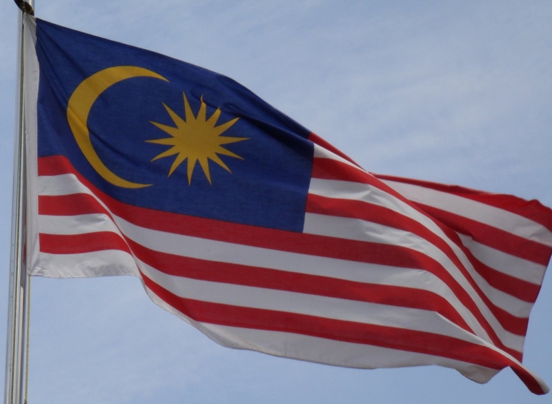
Malaysia
Parsons: It's "too busy," so he gives it a "C-", 52/100.
Michael5000: It's true that all of the red and white stripy action has a certain clown-pants aspect to it, but the yellow-on-blue field is pretty sharp. How many points does that star have? Fourteen? That's got to be worth something!
Grade: B
Maldives
Parsons: "That colour scheme is close to being hideous," he complains, but it is "original." Despite the presence of red and green, he gives it a generous "B-", 70/100.
Michael5000: Well, we've often noticed before that Josh Parsons hates Christmas. But too, he might have been looking at this common rendition of the Maldives banner:
I dunno why this flag is so often represented as having a tennis-ball green central rectangle. It's not in the flag's specs, nor (as seen in the photographic evidence, above) does it seem to be used in real life. Instead, you've got a mature red, a deep forest green, and a white -- not a yellow -- crescent. This is just a theory, but I'm wondering if somebody screwed up an image of the Maldives flag 15 years ago when the internets were young, and the bozo version of the flag has just propagated itself online ever sense. Whatever happened, it's a shame, because the real flag is actually kind of slick.
Grade (for the current flag): A
Mali
Parsons: It's a "bad tricolour," but manages a "B", 70/100.
Michael5000: A good tricolor. Not wildly distinctive among other African flags, but we've talked about Pan-Africanism before and need not rehearse it again.
The real question, when you talk about the flag of Mali, is this: should they, or should they not, have stuck with the 1959-1961 version?
Probably not, but it sure would have won points for distinctiveness.
Grade: B+
Malta
Parsons: It's "too busy," and gets a "B-", 65/100.
Michael5000: At the usual scale of observation, this is a pretty good flag. Its blunt ratio makes it distinctive, and the main visual element is just a nice little plus-sign in the upper left corner. But when you look closer at the plus-sign....
Yep, too busy.
I'm not sure exactly what's up with this, but Malta also seems to have some competing flags in common use as well:
I kind of like these; they are classical, simple, and distinctive. But clearly the good people of Malta need to pick a flag and run with it.
Grade (for the official flag): B-
Marshall Islands
Parsons: "Looks like an airline logo," he muses. This corporate look gets it a "D+", 45/100.
Michael5000: Well, yes. It looks very much like an airline logo. It's distinctive, but...
Grade (for the current flag): C-

 Hats off! Along the street there comes A blare of bugles, a ruffle of drums,
A flash of color beneath the sky: Hats off! The flag is passing by." -- Henry Holcomb Bennett
Hats off! Along the street there comes A blare of bugles, a ruffle of drums,
A flash of color beneath the sky: Hats off! The flag is passing by." -- Henry Holcomb Bennett