Friday, May 13, 2011

Lower the Flag

We ran it up the flag pole... but it just didn't fly.

Neither Michael5000 nor Cartophiliac have been able to generate enough interest in this topic to hold our interest in maintaining a blog just about flags... March Madness was fun, but what are we going to do the rest of the year?

Therefore we are closing up shop. We may leave the blog up for a little while but it will eventually be deleted.

Meanwhile, Michael5000 will likely continue with his occasional Flag Friday ranking of the nation's flags, so continue to read The Life and Times of Michael5000 for your flag fix.

http://michael5000.blogspot.com/

Friday, May 6, 2011

Flag Friday XXVII


Flag Friday is a periodic discussion of the world's national flags; the project is explained and indexed here.

These discussions are about graphic design, and perhaps about nationalism and national symbolism in general. They should not be taken as critical of the countries, ideals, cultures, or people that the flags represent.


Nicaragua


Parsons: "It's probably lucky for Nicaragua that the vile choice of colours in this flag prevents me from seeing what's written on it."  He dislikes the "Writing," the "Bad Colours," the "Bad Shape" (?), and the "Graven Images," and gives it a "D", 40/100.

Michael5000: I've seen the Nicaraguan flag criticized somewhere for not only including the country's name, but it's address -- the text that Parsons could see reads "Republica de Nicaragua - America Central."  I tend to think of the flag of consisting of a blue-white-blue tricolor ("vile choice of colours"?) with a hoop of gold text surrounding a central triangle.  It's when you get into the triangle that things get fussy, pictorial, and strange, with a radiant "cap of freedom" hovering over a mountain range and under a volcano.  Trippy, and pretty much a total fail on the Betsy Ross front.

Grade: C-


Niger


Parsons: "Good Shape."   A "B-", 65/100.

Michael5000: I always likes it when a flag pops up that combines very simple elements in an unusual way, and Niger's circle-in-a-tricolor scheme is a great example.  It's only too bad that the colors are so close to those of India, which has a circle-like figure within its own tricolor.  Officially, Niger's flag has a 6:7 ratio, which is just about as bad a shape as you can get without giving up the rectangle.  Since no one, including the government of Niger (as opposed to the Nigerian government, which is interestingly something completely different) actually uses the almost-square layout, though, we can reasonably ignore it.

Grade: B+


Nigeria


Parsons: Calling it a "Bad Tricolour," Parsons nevertheless gives it a "B," 70/100.

Michael5000: Using common colors in a distinctive scheme that is immediately distinguishable from any other world flag, this is an excellent tricolor.  It's not incredibly exciting, but it embodies the important flaggy virtues.  Technically it's got the 1:2 ratio that we discovered last year is characteristic of former British colonies, but the online evidence suggests that it usually reverts to the 3:5 de facto standard.

Grade: A-


North Korea


Parsons: "The star is very well placed with regard to the shape of the whole flag," writes Parsons, "but the overall design is just somehow lacking in zest." Yet its "Good Shape" must count for something, because he gives it an "A-", 80/100.

Michael5000:  It's hard to find much to like about the DPRK, but their flag is pretty good.  Of course, I'm a sucker for white striplets.  The star-in-circle logo says "Texaco" to me, but I agree that having it offset inward is a nice touch.  And this is a rare occasion that I think 1:2 is a good choice of ratio.

Grade: A-


Norway


Parsons: Without comment, it gets a "B", 74/100.

Michael5000: The flag of Norway is more or less the opposite of the flag of Iceland.  And both of them are awesome.

Grade: A

Tuesday, April 26, 2011

Friday, April 22, 2011

Flag Friday XXVI


Flag Friday is a periodic discussion of the world's national flags; the project is explained and indexed here.

These discussions are about graphic design, and perhaps about nationalism and national symbolism in general. They should not be taken as critical of the countries, ideals, cultures, or people that the flags represent.


Namibia


Parsons: Without comment, the good doctor gives it a "B+", 75/100.

Michael5000: Namibia didn't manage to shake off of South Africa until 1990, so this is one of the more contemporary flags going in Africa.  I like it.  It's got all three primaries and green, which is pretty much an honorary primary, in a memorable and somehow friendly-seeming arrangement.  I guess it's the circle-and-triangles sun that makes it seem upbeat.  I bet some people will call it juvenile, but I think it stays on the dignified side of that line.  And everybody knows I'm a sucker for white stripelets.

Grade: A-


Nauru


Parsons: Disliking a "Corporate Logo" look but feeling that it has a "good shape" (?), the good doctor gives it a "C+", 60/100.

Michael5000: Parsons must not have realized that we're looking at a map here.  Aren't we?  Yes, I just checked, and that's the map of an island that lies just south of the Equator.  Since I don't share Parsons' dislike of maps on flags, that almost makes me want to like it.  Not going to happen, though.  Putting the dominant visual element in the bottom half of a flag, even though I understand the reason, raises my design hackles.  And it really does have a very Corporate Logo look.  This should be the banner of Nauru Airlines, not Nauru.

Grade: C-


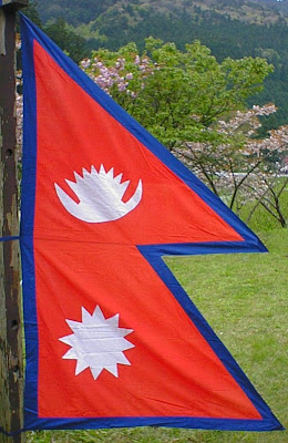
Nepal


Parsons: With a "Bad Shape" but "Original," it ties with Nauru with a "C+", 60/100.

Michael5000: I have an absolutely terrific picture of some kids I work with, kids who grew up in refugee camps in Nepal, clustered around the Nepalese flag in the Hall of Flags on the Oregon State University campus, amazed to see such a familiar thing in such an unexpected context.  I'm not going to stick it online, for obvious reasons.  But, it's extremely cute.  

Yet even while I was taking the picture, I was wondering if it's really quite.... fair for Nepal to be quite so Bohemian (so to speak) in its flag design.  I mean, is that even properly a flag?  Innit more of a pendant?  Couldn't that design just been attached to a white field to make a still very distinct, but properly flag-shaped, national banner?


Hmm, I guess not.  It was worth a try, though.

Grade (for the real "flag"): C+


Netherlands


Parsons: No comments -- only a "B", 70/100.

Michael5000:   Back when we talked about Luxembourg, in addition making an embarrassing gaffe, I gave that little country's flag -- nearly identical to Netherland's -- a B-.  However, Luxembourg was getting graded down for creating a modern flag so easily confused with the very long-standing flag of a neighbor.  Very long-standing.  Very, very longstanding.  1572 longstanding.  This is, in fact, the original horizontal tricolor.  So where Luxembourg was derivative, the Netherlands is rocking an innovative design, and obviously one that has turned out to have some enduring appeal.  Got to respect that.

Grade: A


New Zealand


Parsons: Dr. Parsons can't be said to be too partial to the home team.  He dislikes the "Colonial Nonsense" of his own country's flag, and gives it only a "C", 55/100.

Michael5000: See Australia.  Mitigated by fewer and nicer stars.

Grade: C+

Monday, April 18, 2011

Patriotic Vexillophilia, c. 1915


"The Allied Flags"
Raphael Tuck & Sons' "Oilette" Postcard No. 8729

Friday, April 15, 2011

Well, Not Everyone is a Maps & Flags Person....


Image randomly encountered on internet, February 2011.

Friday, April 8, 2011

For the Fan that Takes His Vexillophilia Seriously


Via American Flag & Gift

Flag Friday XXV


Flag Friday is a periodic discussion of the world's national flags; the project is explained and indexed here.

These discussions are about graphic design, and perhaps about nationalism and national symbolism in general. They should not be taken as critical of the countries, ideals, cultures, or people that the flags represent.


Monaco


Parsons: "Yawn..." writes Parsons.  "Nice shape, but nearly as boring as Libya."  Still, it gets a "B", 70/100.

Michael5000: This is pretty much the same flag as that of Indonesia.  Well, Indonesia is in the 2:3 ratio and Monaco is officially 4:5, but in practice Monaco usually gets tweaked to 2:3, so Bob's your uncle. I checked back to make sure I'm giving the two the same grade, and it looks like Parsons did too.

Grade: B-


Mongolia


Parsons: "Too Busy."   A "C+", 60/100.

Michael5000: Oh, I dunno.  The golden business on the inside panel (the "Soyombo") is a little complicated, but it's all in one color, the shapes are pretty big and simple, and it's an important national symbol.  It's no busier than, say, a set of five stars.  I like the coloration, and the red-light blue-red vertical tricolor base is pretty keen.  And it's got good distinctiveness and recognizability.  I'm liking the flag of Mongolia.

Grade: A-


Montenegro


Parsons: Montenegro has been something of an on-again, off-again country for the past eleven centuries.  It was not on the map when Parsons made his sweep, but it's on again as of June 2006.

Michael5000: Whoa, what century is this?  The flag of the newest (I think) country going looks decidedly like one of the flags of the world as depicted on a 1880s cigar box.  Or maybe like the lid of an 1880s cigar box.  Is that really the flag?


Yup, guess it is.  I'm going to give it points for distinctiveness, obviously -- although it's not a radical departure from neighboring Albania -- and, once we get used to Montenegro being on again, recognizability.  Also, the central device uses only a modest three colors, so it is capable of being rendered in applique as opposed to screenprinting -- extremely laboriously, though.  And obviously, there's a real traditional look here.  Let's see...  we'll give it a....

Grade (for the current flag): B


Morocco


Parsons: "Apart from the colours, this is a nice design," writes Parsons.  "Pentagram is a bit adolescent though."  It has "Bad Colours," it's "eye-watering," but it's "simple," and it gets a "B", 72/100.

Michael5000:   In fairness to the flag and peoples of Morocco, I don't believe that the pentagram had acquired its heavy-metal connotations at the time of their flag design, 1915.  This design, although hard on the red/green colorblind, is surprisingly distinctive -- I can't think of another open star out sides of Israel's off the bat, and that one is six-sided.

Grade: B


Mozambique


Parsons: Dr. Parsons is not a fan.  "Automatic weapons on a flag are especially bad," he says.  Appears to have been designed by a committee all of whom had stupid ideas for pictures of extra things to put on the flag. With "weapons" and "graven images" and being "too busy," it gets a "D-", 37/100.

Michael5000: Well, Mozambique has not had an easy road, and if I'd been part of the Portuguese colonial empire until the 1970s I might be inclined to put an automatic weapon on my flag too.  That being said, it true that it doesn't send a really upbeat message.  Parsons is moreover joined by the parliamentary opposition in Mozambique, who object not only to the bad vibes of the machine gun but also to the national flag consisting  of the symbols of the ruling party.  And yes, the stack of AK-47, hoe, book, and star really is a pretty busy business.

I like the white stripelets, though, and it doesn't look half bad on a flagpole:


Let's give it a:

Grade: B


Thursday, March 31, 2011

March Madness: THE NATIONAL CHAMPION!!!

Well, it's been a month of thrilling victories and agonizing defeats on the long road from from the regional openers through the sweet sixteen and the final four to our final matchup between upstart 47th state New Mexico and old-school colonial Maryland; between the fifth-largest state in the union and the state with the fifth largest population density.


And for this round only, I'll do something I haven't done in all the rest of the tournament. I'll vote myself.


So here's my vote for the best flag of the U.S. States and Territories!

South Carolina

Unfortunately, all y'all didn't even let it into the Elite Eight, so I guess I'll do like everybody else and cast my vote from the choices I have available.

Maryland!

But that's just my vote!

So, with no further ado....

the winner of the March Madness U.S. States and Territories Flag Tournament is......
.
.
.
.
.
.
.
.
.
.
.
.
.
.
.
.
.
.
.
.
.
.
.
.
.
.


New Mexico defeats Maryland, 21 - 13!!!


Congratulations to the good folks of New Mexico and thanks to everybody who played along with my goofy little project.  Here's one last look at the bracket.  Hope you had a great March!

Monday, March 28, 2011

March Madness: The National Championship Match

It's been a month of flaggy heartbreak as the field of 56 flags of U.S. States and Territories has gradually been winnowed down to two. And today, they go head to head.

Our contestants for the national title are 1) New Mexico, which took out Ohio easily in the semi-final matchup, 20-5.  2) Maryland, which survived a tough fight against Tennessee to come out on top, 14-11.

They're bright!  They're vivid!  And they're going to the mat.  Votes will be counted at 6 p.m. PDT on Wednesday, March 30.


New Mexico


Maryland


Place your votes in the comments!


Thursday, March 24, 2011

March Madness: National Semifinals

March Madness: National Semifinals


The Rules: For each of the pairs of flags pitted against each other, indicate your favorite.  Explication, derision, and/or analysis will not affect the scoring, but is nevertheless encouraged.  Each winner will advance to the Final.


North and West Finals Voting Deadline: 9 a.m. PDT, Sunday, March 27.


North Champion vs. West Champion


Ohio vs. New Mexico

Ohio

New Mexico


East Champion vs. South Champion


Maryland vs. Tennessee

Maryland


Tennessee

Make your votes in the comments.

The Final Four Verbiage

...and then there were four, as the 2011 tournament winds down to its final few games.  Upsets abounded in the regional finals, all of which were highly competitive among L&TM5K voters but decided but near unanimity among Vexillophiliacs.  The only #1 seed still standing is Maryland, which knocked down the District of Columbia 17-10; Maryland will take on #5 seed Tennessee, which upset #2 Puerto Rico by the same score.

In both the North and West, #1 seeds fell to #2, with New Mexico besting Alaska 18-8 and Ohio topping Wyoming 17-9.  Tennessee is the only fly still flying, however, which was playing on opening day; New Mexico, Ohio, and Maryland all entered the tournament with a bye-week.

Tuesday, March 22, 2011

March Madness: North and West Finals!!!

March Madness: North and West Finals!!!


The Rules: For each of the pairs of flags pitted against each other, indicate your favorite.  Explication, derision, and/or analysis will not affect the scoring, but is nevertheless encouraged.  Each winner will advance to the Final.


North and West Finals Voting Deadline: 9 p.m. PDT, TOMMOROW, Wednesday, March 23.
South and East Finals Voting Deadline: 9 p.m. PDT, TODAY Tuesday, March 22.


North Final


Wyoming vs. Ohio 

Wyoming

Ohio


West Final


Alaska vs. New Mexico

Alaska

New Mexico

Make your votes in the comments.

Monday, March 21, 2011

Then Everything Changed

I am a big fan of the "Alternate History" genre of fiction: stories about "what if". For more info about alternate history books, check out Uchronia.

I am currently reading Then Everything Changed: Stunning Alternate Histories of American Politics: JFK, RFK, Carter, Ford, Reagan, by Jeff Greenfield. What if JFK did not survive to his inauguration? What if RFK did? How would history have turned out differently? For more, see this New York Times review.

Of course, the reason it is featured here is the interesting flag graphic on the cover, with the stripes on the American flag veering off in unforeseen directions.

March Madness: South and East Finals!!!

March Madness: South and East Finals!!!


The Rules: For each of the pairs of flags pitted against each other, indicate your favorite.  Explication, derision, and/or analysis will not affect the scoring, but is nevertheless encouraged.  Each winner will advance to the Final Four.

South and East Finals Voting Deadline: 9 p.m. PDT, TOMORROW, Tuesday, March 22.


East Final


Maryland vs. District of Columbia

Maryland

District of Columbia


South Final


Tennessee vs. Puerto Rico

Tennessee


Puerto Rico

Make your votes in the comments.

March Madness Semifinal Results!

East

#1 Maryland 19, #4 Massachusetts 5
#3 D.C. 18, #2 Rhode Island 6

South

#5 Tennessee 13, #1 South Carolina 11 (Upset!!)
#2 Puerto Rico 19, #3 Texas 5

North

#1 Wyoming 19, #5 Iowa 7
#2 Ohio 15, #3 Indiana 11

West

#1 Alaska 16, #4 Hawaii 10
#2 New Mexico 20, #3 Arizona 5

Friday, March 18, 2011

March Madness: North and West Semifinals

March Madness: North and West Semifinals!!!


The Rules: For each of the pairs of flags pitted against each other, indicate your favorite.  Explication, derision, and/or analysis will not affect the scoring, but is nevertheless encouraged.  Each winner will advance to the Sweet Sixteen.


North and West Semifinals Voting Deadline: 9 p.m. PDT, Sunday, March 20.
South and East Semifinals Voting Deadline: 9 p.m. PDT, Saturday, March 19.


North


Wyoming vs. Iowa

Wyoming

Iowa


Indiana vs. Ohio

Indiana

Ohio


West


Alaska vs. Hawaii

Alaska

Hawaii


Arizona vs. New Mexico

Arizona

New Mexico

Make your votes in the comments.