 Flag Friday is a periodic discussion of the world's national flags; the project is explained and indexed here.
These discussions are about graphic design, and perhaps about nationalism and national symbolism in general. They should not be taken as critical of the countries, ideals, cultures, or people that the flags represent.
Namibia
Parsons: Without comment, the good doctor gives it a "B+", 75/100.
Michael5000: Namibia didn't manage to shake off of South Africa until 1990, so this is one of the more contemporary flags going in Africa. I like it. It's got all three primaries and green, which is pretty much an honorary primary, in a memorable and somehow friendly-seeming arrangement. I guess it's the circle-and-triangles sun that makes it seem upbeat. I bet some people will call it juvenile, but I think it stays on the dignified side of that line. And everybody knows I'm a sucker for white stripelets.
Grade: A-
Nauru
Parsons: Disliking a "Corporate Logo" look but feeling that it has a "good shape" (?), the good doctor gives it a "C+", 60/100.
Michael5000: Parsons must not have realized that we're looking at a map here. Aren't we? Yes, I just checked, and that's the map of an island that lies just south of the Equator. Since I don't share Parsons' dislike of maps on flags, that almost makes me want to like it. Not going to happen, though. Putting the dominant visual element in the bottom half of a flag, even though I understand the reason, raises my design hackles. And it really does have a very Corporate Logo look. This should be the banner of Nauru Airlines, not Nauru.
Grade: C-
Nepal
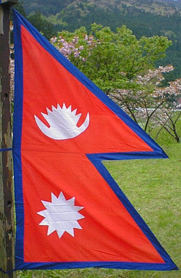
Parsons: With a "Bad Shape" but "Original," it ties with Nauru with a "C+", 60/100.
Michael5000: I have an absolutely terrific picture of some kids I work with, kids who grew up in refugee camps in Nepal, clustered around the Nepalese flag in the Hall of Flags on the Oregon State University campus, amazed to see such a familiar thing in such an unexpected context. I'm not going to stick it online, for obvious reasons. But, it's extremely cute.
Yet even while I was taking the picture, I was wondering if it's really quite....
fair for Nepal to be quite so Bohemian (so to speak) in its flag design. I mean, is that even properly a
flag? Innit more of a
pendant? Couldn't that design just been attached to a white field to make a still very distinct, but properly flag-shaped, national banner?
Hmm, I guess not. It was worth a try, though.
Grade (for the real "flag"): C+
Netherlands
Parsons: No comments -- only a "B", 70/100.
Michael5000: Back when we talked about
Luxembourg, in addition making an embarrassing gaffe, I gave that little country's flag -- nearly identical to Netherland's -- a B-. However, Luxembourg was getting graded down for creating a modern flag so easily confused with the very long-standing flag of a neighbor.
Very long-standing.
Very, very longstanding. 1572 longstanding. This is, in fact, the original horizontal tricolor. So where Luxembourg was derivative, the Netherlands is rocking an innovative design, and obviously one that has turned out to have some enduring appeal. Got to respect that.
Grade: A
New Zealand
Parsons: Dr. Parsons can't be said to be too partial to the home team. He dislikes the "Colonial Nonsense" of his own country's flag, and gives it only a "C", 55/100.
Michael5000: See
Australia. Mitigated by fewer and nicer stars.
Grade: C+

 Hats off! Along the street there comes A blare of bugles, a ruffle of drums,
A flash of color beneath the sky: Hats off! The flag is passing by." -- Henry Holcomb Bennett


